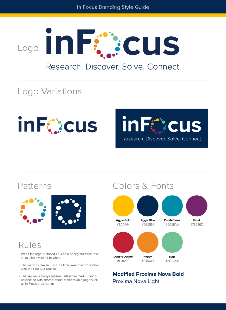
UC Davis was in search of a new brand for it’s featured news content. They decided to use the term I coined for the featured section of the news site and gave it the moniker “In Focus.” Marketing asked me to redesign the web sections devoted to this content and bring it all together with a visual brand.
Each section of our featured news was assigned a color so I used the category colors to create an abstracted aperture shape which brought both motion and meaning to the mark. The shape also allowed for greater unification of the content between the articles and categories acting as a callback on everything from campaign pages to print ads.