
UC Davis 6.0


A long journey that ended with a Webby
Project overview
The UC Davis homesite is the flagship web channel for the university. The website has a number of audiences, but prospective students generate the overwhelming bulk of the page views, using the site to determine if UC Davis will be a fit for their academic pursuits. The behaviors of the other audiences vary, with news and job seeking being the most common auxiliary journeys.
Exploring the problem
The existing site analytics painted a very clear picture. Bounce rates were extremely high, consistently over 70% for most pages and time on page was very low with very few pages over 30 seconds. The prioritized content, namely news and marketing campaigns had little to no engagement, paltry page views and poor bounce rates.
My Role:
- Art direction
- Product design
- UX/UI design & research
- Front-end development
- Information Architecture
- Content Strategy
Research
We started with traditional direct UX observational techniques and after determining some short comings added site monitoring and deeper analytics dives to drive insights and get the receipts we knew would be necessary to convince our stakeholders a drastic change of strategy would be warranted. Here are a couple of techniques we used to get the data we needed.
Analytics
Site data allowed us to better define user flows, user loops and clear browsing confusion for the majority of our key audiences. It also gave us the quantitative data to clearly identify a new target audience.
Focus Groups
This helped us determine the psychological states and motivations of our users, as well as the common pain points of the college search process. We would eventually return to this process for design review.
Task Analysis
We observed users going through common site tasks using the two-way mirror in our child psychology department and again confirmed user loops and navigational confusion that left most users frustrated. We also found that the testing environment led to some unnatural user behaviors which eventually led us to more passive data collection techniques.
Behavioral Analytics
Eventually we added the use of screen recording technology to follow users through our primary journeys. We found the passive data collection presented a much more accurate picture of user behaviors and were able to reconfigure our primary product pages (majors) to better serve audiences based on this new data.
Competitor Analysis
I decided to take the risk ignoring our direct competitors in higher education who were still under the same misguided ideas that had hampered our previous designs and instead explored the digital ecosphere of our target audience. I looked at social media channels, gaming sites, fashion and e-commerce sites that targeted the same demo. I found extensive uses of color and highly graphical interfaces. Absent were the long text descriptions, bland color palettes and prestige focused content strategies that were the focus of not only our site, but most of higher education at that point.
Persona Development & Journey Mapping
Using our quantitative research we were able to generate several user personas, and from those created journey maps documenting everything from Aliya the California high school student’s journey through our sales funnel to John the dog owner’s deep dive into our veterinary knowledge-base articles.
Problem Statement
After completing our initial research we settled on an obvious and challenging fact…the content strategy, information architecture, user experience and general aesthetic of our existing site were all designed to satisfy the wrong audience. We were ignoring prospectives and instead focusing on the news audience and a few let’s just call them ‘aspirational’ audiences. The previous iteration of the site had been overwhelmingly stakeholder driven and the result was a site that generated very little engagement from users and acted more as a pass through directory to subsites of the university. So basically the entire channel was a user impediment that added unnecessary steps to user flows. This meant two things…we were going to have a major refactor and we were going to have to convince stakeholders that they had significantly missed the mark. I gathered the data into a strong presentation for our director and he was able to convince the numerous stakeholders involved in our project to accept our proposed changes, allowing us to move on to the design phase.
Design Process
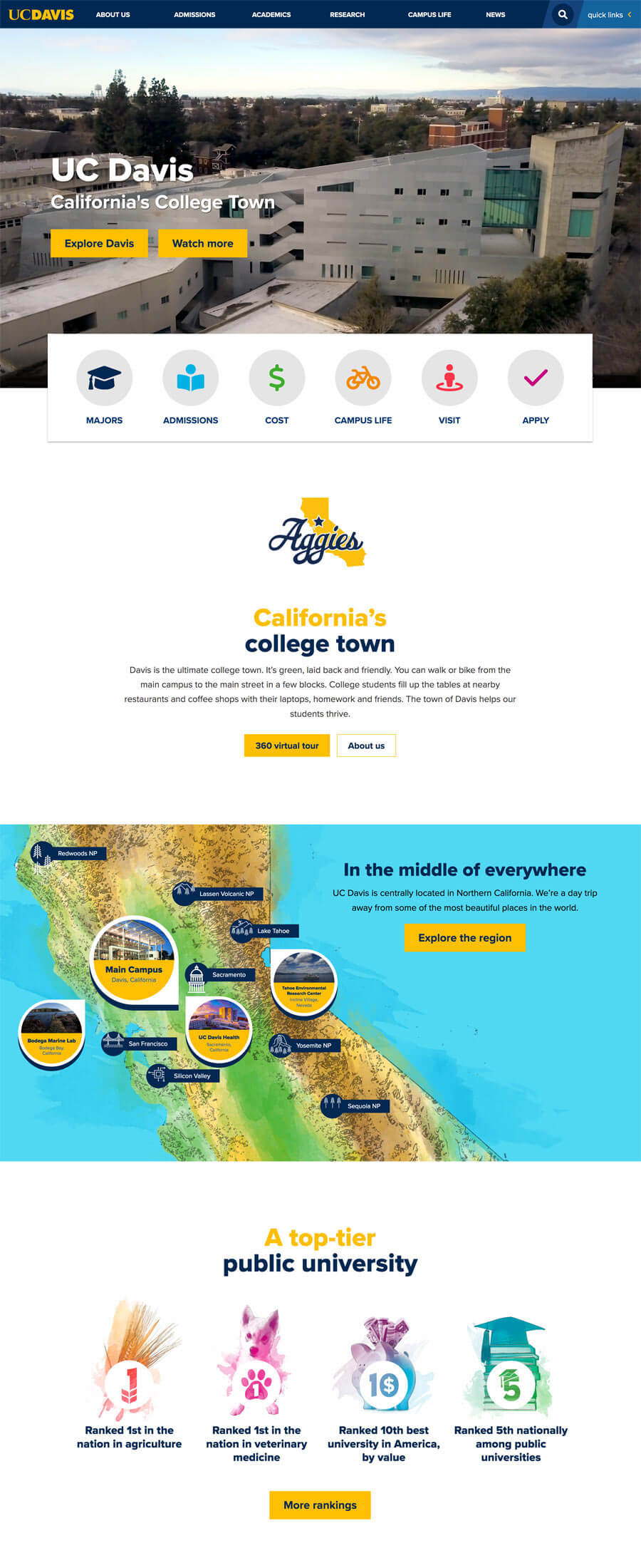
With all of this new information, I dove into the design process. I had been waiting years to get my shot at the biggest channel at the university and enjoyed trying to tackle this rather large and unique design problem. I went bold. I took large design risks by following a much more art-forward style, filled with fun, dynamic, youth-focused imagery and a significantly expanded brand palette. I felt our brand needed to reflect the exuberance I’d discovered was such a foundational aspect of our primary audience. These young adults were anxious about the admissions process but incredibly excited for the next step in their lives. The new brighter, more accessible aesthetic resonated with them immediately in early testing and the preference grew the more we exposed them to it.
Understanding my stakeholder audience well enough from previous design reviews to know sketches and wireframes were not really important to them, I moved quickly into hifi prototypes and even A/B tested the designs with audiences usings Qualtrics visual surveys beforehand in order to have audience approved turn key design options ready for our second round of stakeholder presentations.
Delightful interactions
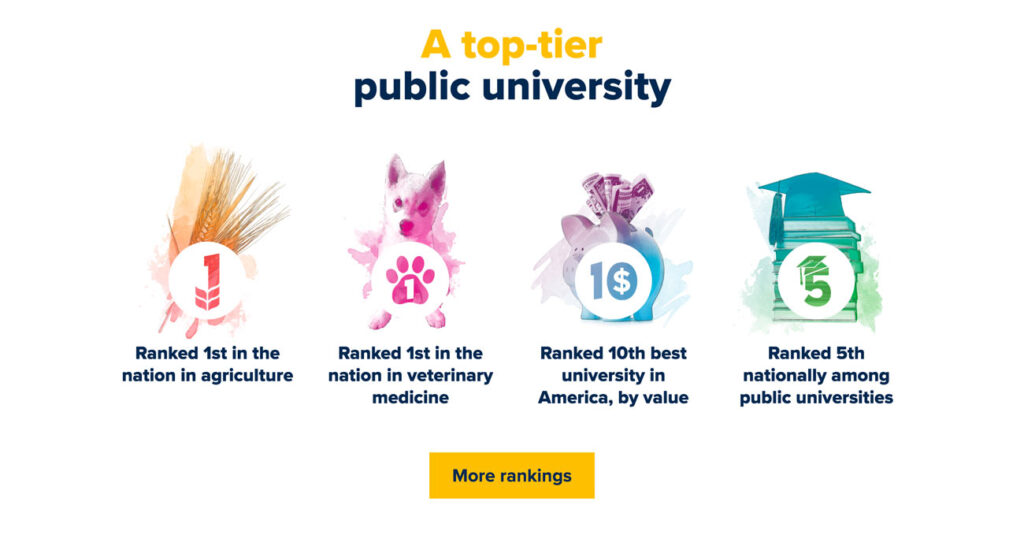
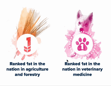
Interaction design can be challenging on an enterprise-level CMS driven site due to legacy platform issues and the shear scope of the project, but I was able to sneak a few nice interactions into my user stories. Knowing these would be limited, I decided to prioritize our top level calls to action in the sales funnel and our rankings. The rankings are my favorite. I used a CSS masking technique to bring the water color style of the brand to life on hover and even snuck a picture of my dog in there to represent our world veterinary ranking!
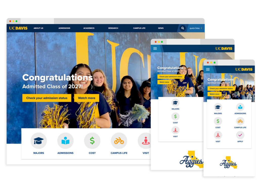
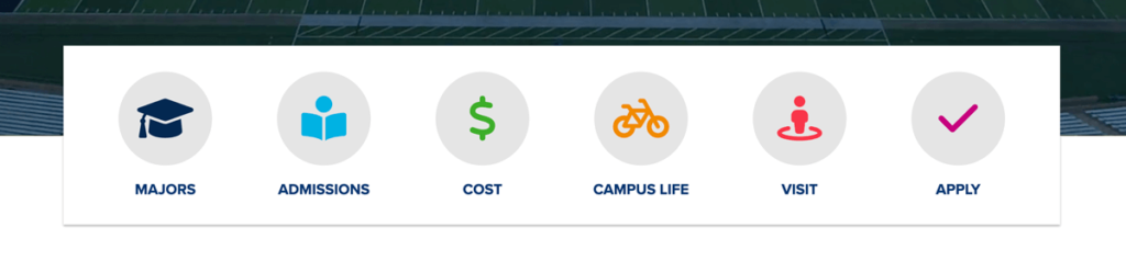
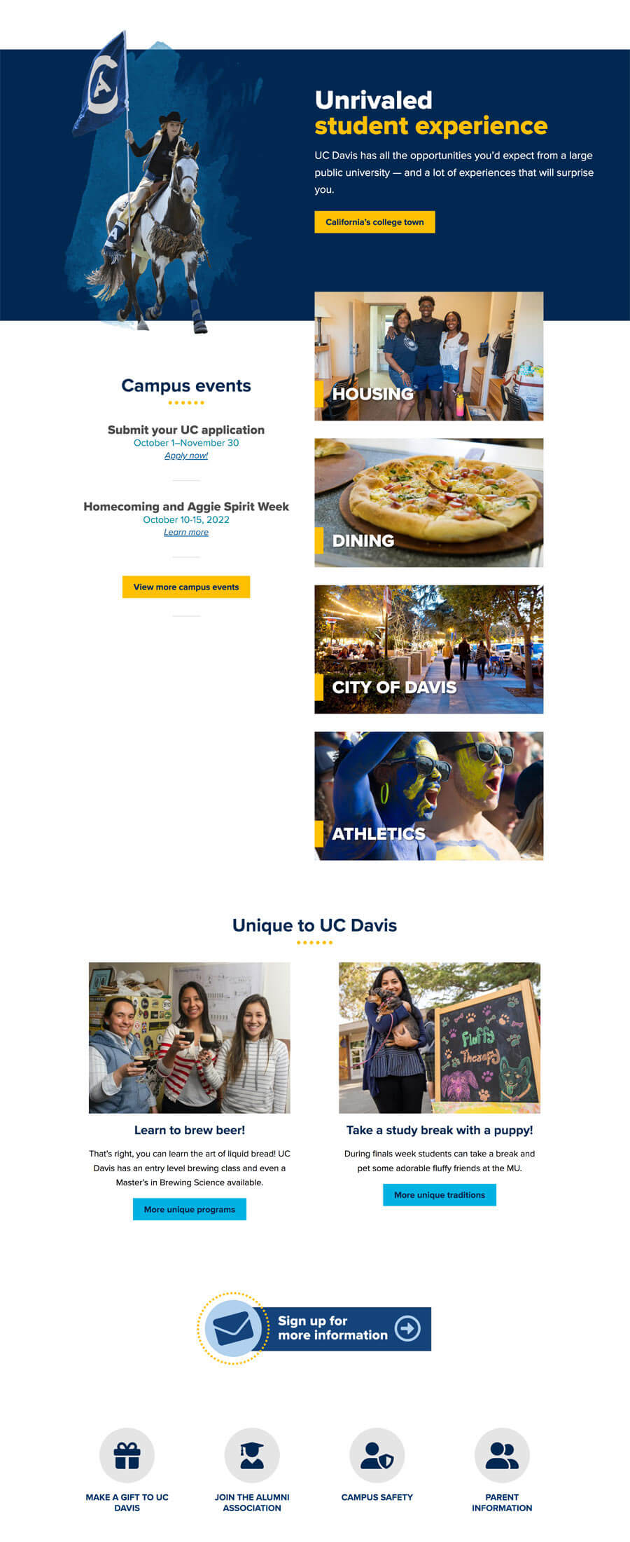
Putting the Primary User Flow Front and Center
Once we established our primary audience, I went to work identifying their most common user flow. We identified our product as our majors and our conversion as the application process, and through data analysis and interviews filled in the rest. Because we had such a comprehensive main navigation that could not change extensively for political reasons, I suggested pulling the flow out and placing it front and center at the base of the website hero and every stop along the way.
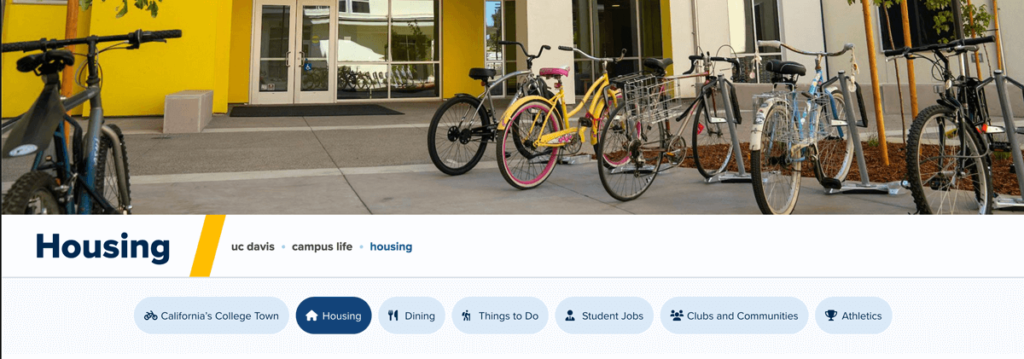
Reorganizing subnavs
Through analytics review and card sorting exercises we were able to cut the size of our average subnav in half and present them to users in a more aesthetically pleasing and accessible fashion.
Keeping scale front of mind
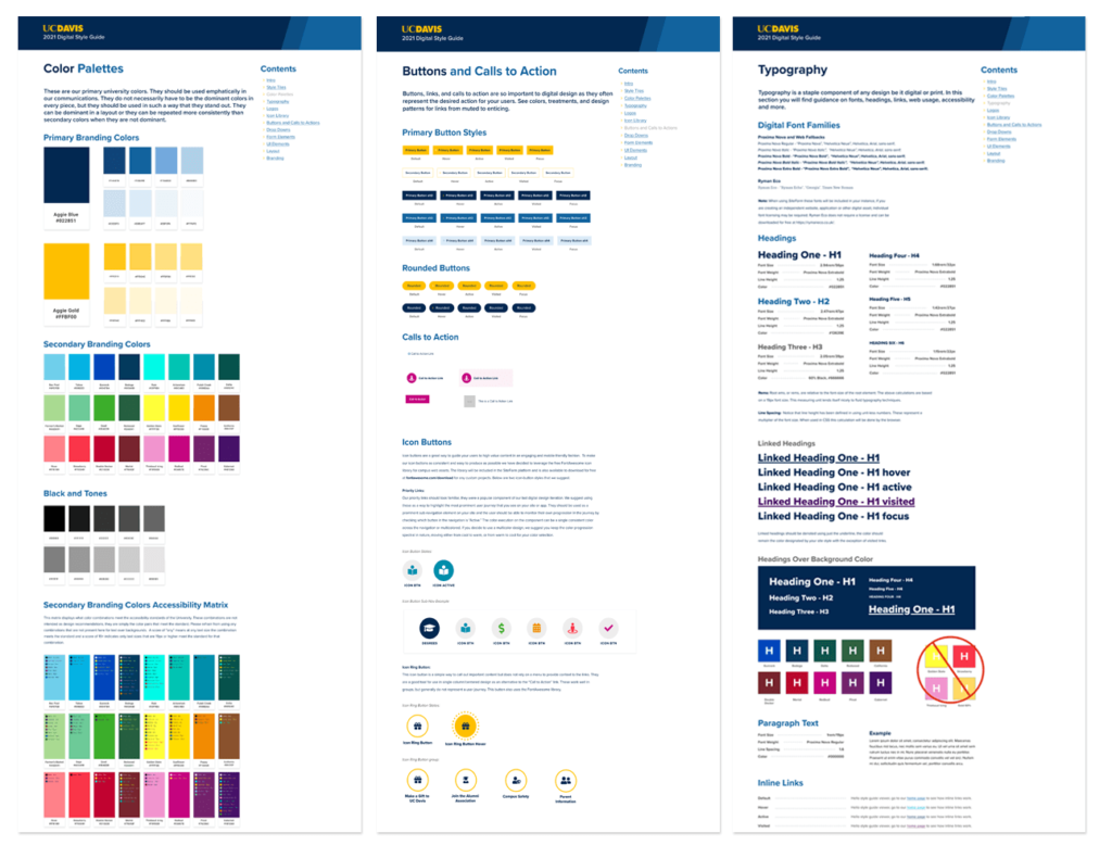
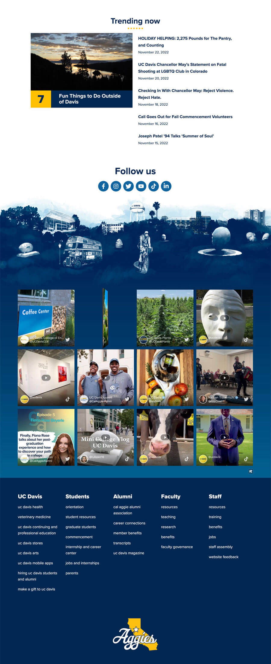
The UC Davis homesite is part of a campus network of over a thousand websites within our campus Drupal CMS and several independent proprietary software applications. Given this breadth, I created a visual language and web components capable of adapting to a wide range of product requirements. To achieve this, I ensured that flexibility was a fundamental aspect of all component designs and established an atomic design system capable of producing layouts that were effective in a diverse set of platforms.
Enterprise website
Results
Massive Engagement Improvements
- Bounce rate decrease from the high 70’s to the mid 50’s
- Page time increase average from 30 sec to the 1min30sec range
- User increase of over 100%
- Page view increase of 228% for pages targeting our key demo
New Campus Web Platform
Our redesign became the foundation from which our new Drupal CMS implementation SiteFarm was built. Our design and branding systems as well as over all content strategy and SEO improvements now guide the strategies of over 100 sites campus wide and in doing so have unified our digital branding and user experience for the first time ever.
A WEBBY!
- One of only 6 websites in the world nominated in the Higher Ed Category
- 2022 Webby People’s Voice Winner, Websites and Mobile Sites School/University
Let's work
Whether you need a complete rebrand, site audit, new content strategy or even want to commission a work of art, I would love to talk shop.
