
Sonoma State


Redesigning an entire digital presence
Project overview
The Sonoma State digital redesign included a complete reimagining of the Visual Design, UX/UI, Information Architecture and content strategy for their homesite, admissions website and several other top level pages. In addition a limited design system would be produced to help guide their entire web platform.
Exploring the problem
I was brought in to help SSU create a digital strategy to reverse a trend of declining enrollment. SSU suspected the decline was tied to their digital prospective student experience. After only a shallow dive into their web ecosystem, several issues became evident. SSU’s information architecture was difficult to navigate, with much of their key prospective student content hidden or in contextually inappropriate locations. They also had fundamental issues with their design including inefficient layouts and dated visual styles. All of that coupled with an impatient content strategy appeared to be major factors in the aforementioned decline.
My Role:
- Art direction
- Product design
- UX/UI design & research
- Information Architecture
- Content Strategy
Research
Because the scope of the project was so large and the budget so tight, I leveraged my previous knowledge of their key demos and focused on their analytics, stakeholder groups and competitors.
Analytics
The web traffic to the SSU homesite indicated a strong prospective student audience, followed by healthy current student, staff and faculty behaviors. Six of the top ten pages are prospective focused and the traffic on the other four were shared among the three audiences. The behaviors on the admissions site were driven primarily by the early content focus on the “Apply” page. Several of the most visited pages pertained either directly to the application or the application process. There was very little consumption of campus life or even academic content. I determined that their premature focus on the application process was discouraging the exploratory behavior so essential for prospective students to determine if a university is a strong fit for their needs.
Stakeholder Interviews
I interviewed several groups of department stakeholders allowing them to vent pain points and share what they felt were missed opportunities to increase user engagement. Common threads emerged from these groups including dissatisfaction with the information architecture, simplicity of the visual design, poor SEO and the lack of user visibility for their respective departments.
Competitor Analysis
Looking at the digital properties of other state schools in the region I discovered similar issues with navigational structures and poorly executed visual design. Many of them had similarly ambiguous menus and inefficient layouts. In many ways this was good news, as it provided SSU with the opportunity to gain an advantage over most of their direct competition.
Problem statement
My research confirmed many of my initial suspicions. A confusing navigational landscape, an impatient and disparate content presentation and a lack of more search-visible information was making it harder for prospective students to accomplish their tasks. Their core audience was having a hard time finding the information they needed and when they finally did they were aggressively pushed straight into the application process.
My solutions
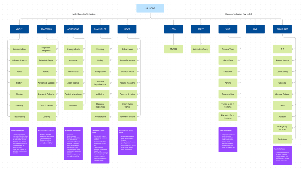
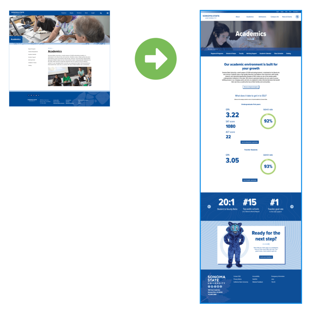
Revamping Information Architecture
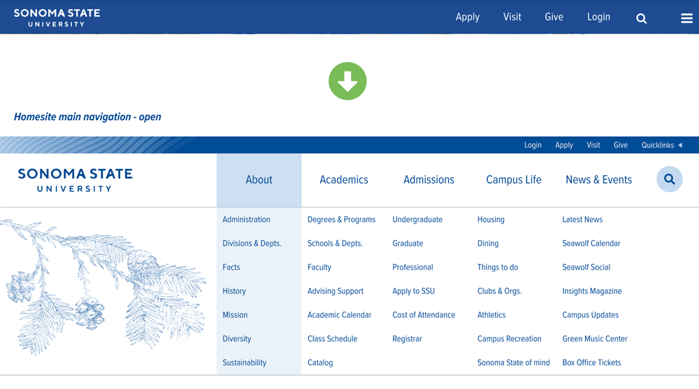
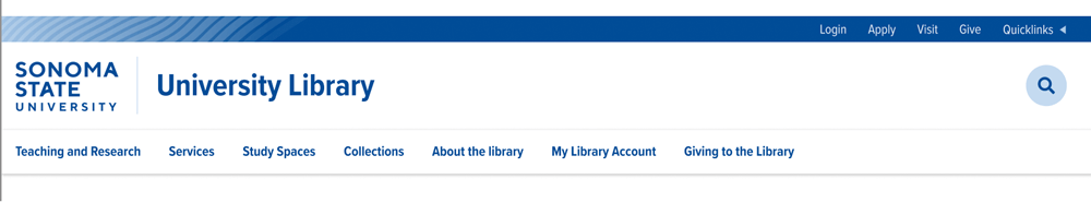
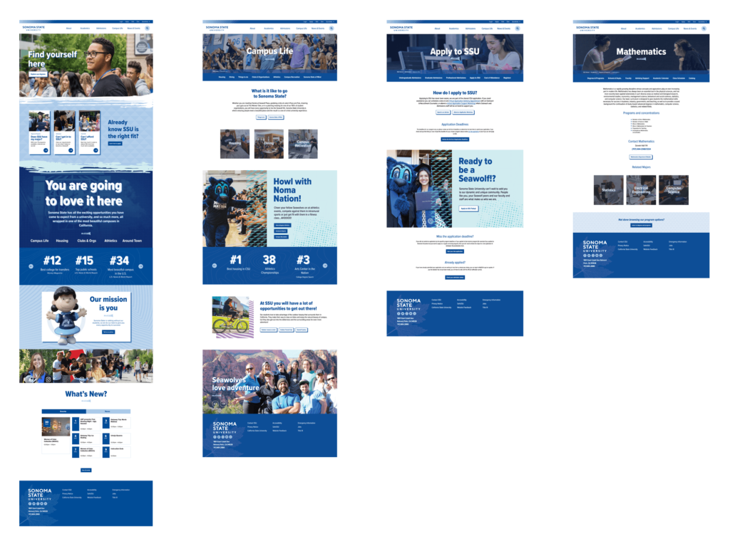
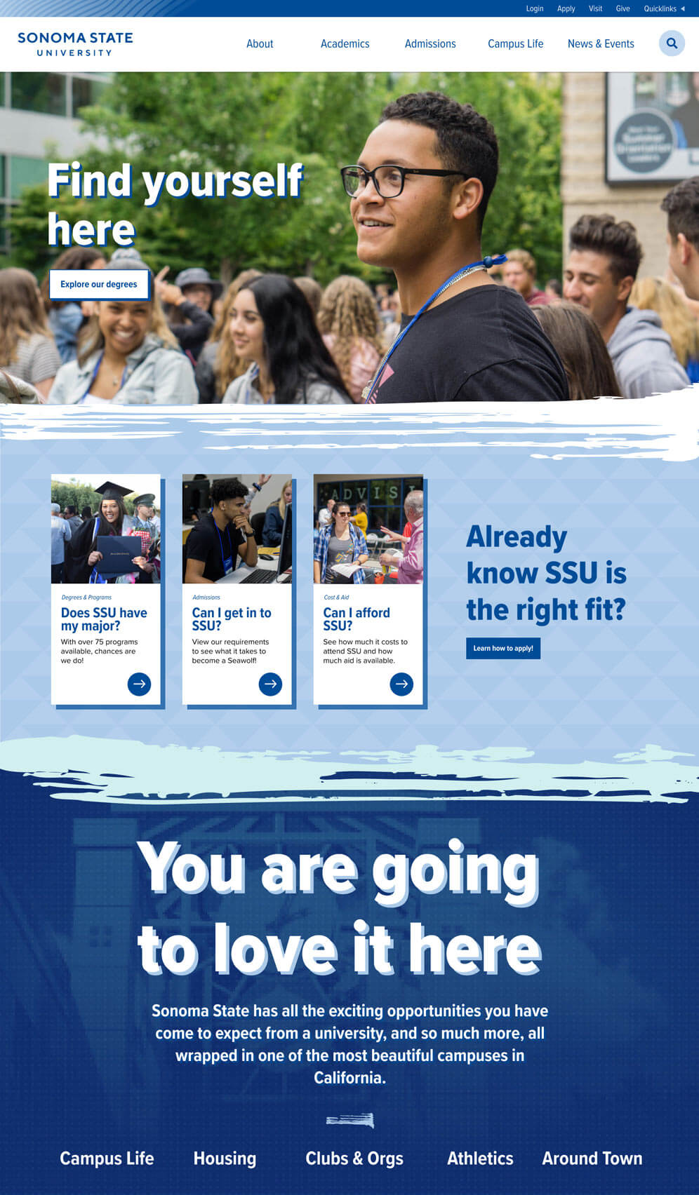
The first step was creating an entirely new Information Architecture for their flagship website that would serve as a model for other high level pages. I visually demoted their universal menu and created custom menus for each top level page. I restructured the links to better represent common higher education experiences and journeys and created a similar template for subsite menus to unify the platform experience. To amplify the visual design of the header I introduced some of their unused brand patterns and added smooth and enjoyable micro interactions to the menu experience.
Content Consolidation & Strategy
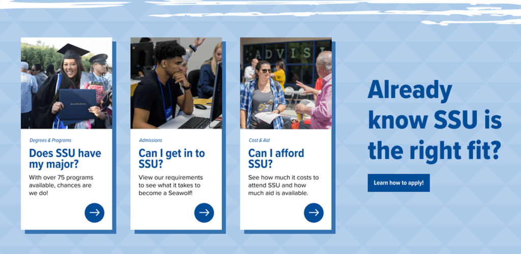
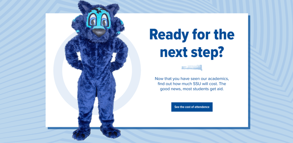
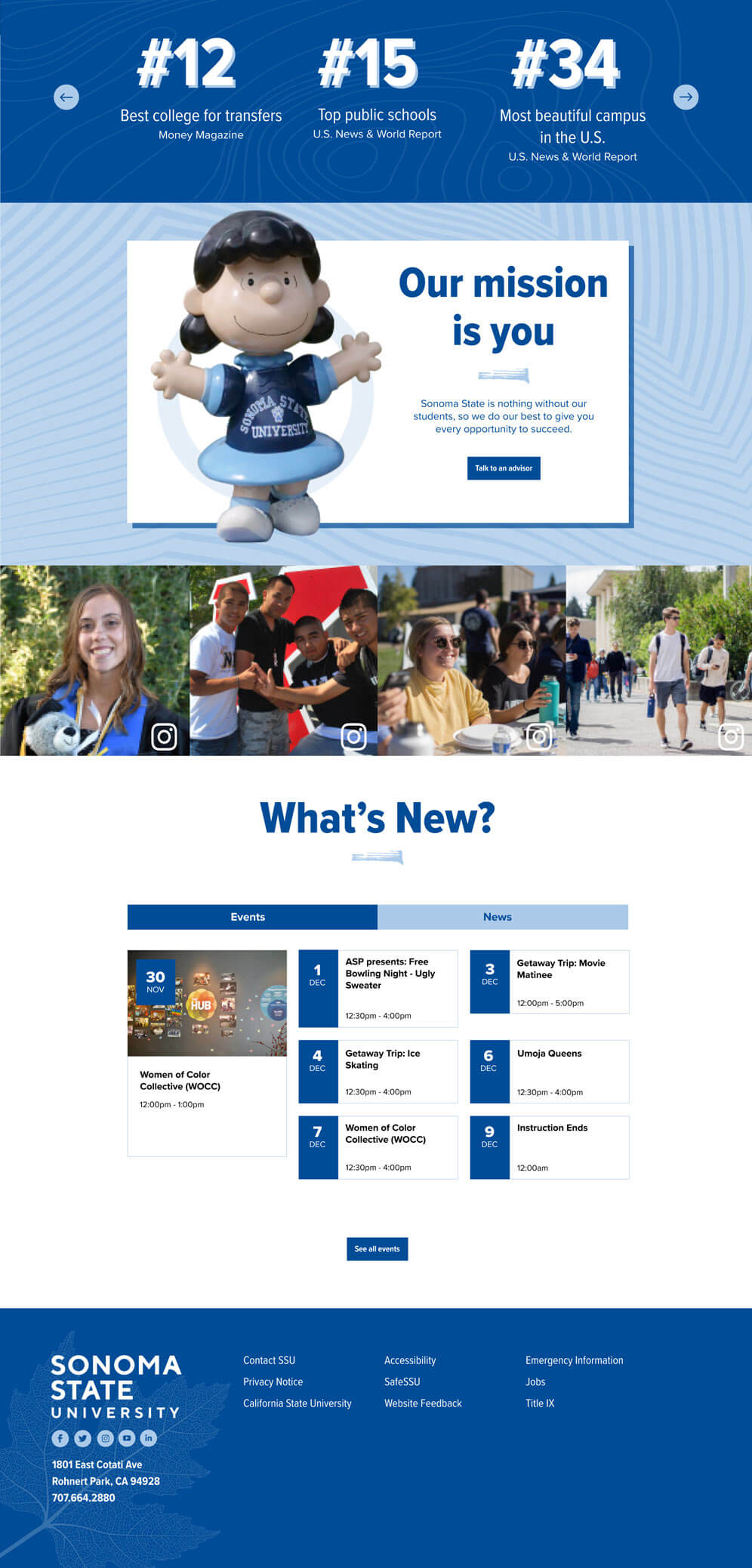
To eliminate superfluous steps in many of their primary user flows I created layouts that allowed for more informative content to be present on each page without compromising readability and in turn led to much smaller tertiary menus. I also added contextually appropriate supportive marketing content and finished the pages of with a “Next Steps” section to help them through their journey. To give their users the room they need to make their decision to apply, I reorganized the flows to include more persuasive content, like campus life and housing before demanding an application.
Search Engine Optimization
I refreshed titles, headings and core content to include more high value key words and intuitive phrasing. I created content specifically designed to answer the core questions of their audiences…quite literally. Headings like Can I get in to SSU?, and What is there to do at SSU?, were created to elevate the search visibility of key pages and possibly achieve knowledge graph status on SERPs. These new titles also directly addressed the anxieties and needs of the audience, a technique I had previously found successful in previous projects targeting this demo. I also suggested the creation of supportive content like blogs and videos specifically addressing prospective student concerns to both expand their reach and support their existing content with contextual and cross linking.
Creating a richer design experience
Primary user flow
This wasn’t my first rodeo in higher ed and I applied many of the lessons learned from earlier projects to my work for SSU in order to keep the project within budget constraints. One opportunity I felt would be low hanging fruit was the admission user flow. I added some intermediate steps to the flow to allow room for more persuasive content while maintaining access to the apply button for those that were ready for that step. To make this journey as easy as possible for users I created a prominent layout on the homepage to walk them through it step by step and created a “next steps” section at the bottom of each page where the mascot escorts them with ever evolving poses to the next part of the process.
Simplifying access to the product
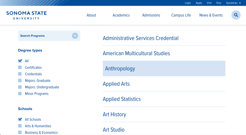
The existing page for SSU’s Degrees and Programs was built in a card view that made it extremely difficult to browse and linked off to the department website without any further information about the major. To improve the experience I created a simple alphabetical list that could easily be explored and filtered by the user and created a degree page content type to better describe the programs and provide opportunities for added cross-linking with similar degrees.
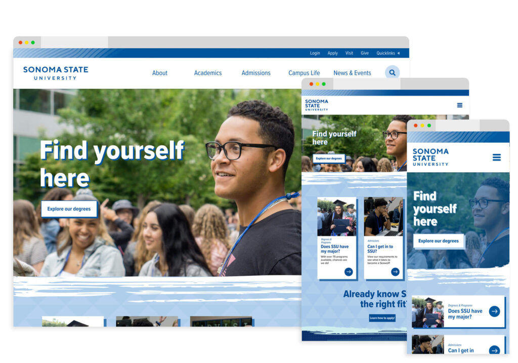
More dynamic layouts and simpler interfaces
The existing site lacked the energy and simplicity so common in websites targeting the youth demographic so I used several of the patterns available in the brand suite to introduce some vitality back into the pages and coupled that with large colorful photos and graphical elements. The results were much more interesting and enjoyable page reads, an overall tone that better matched key audiences and simpler interfaces on informational pages. Because I was designing for CMS I built the site with modular and interchangeable design elements that could easily be translated into page components.
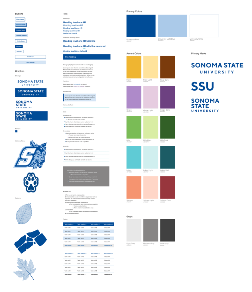
Budget friendly design system
To operate within budget constraints, I created a design system limited to the scope of the deliverables. The system was part of a final product delivery which included, high fidelity interactive prototypes for desktop, mobile and tablet as well as a full consultation brief describing the scope of the project and detailed instructions for improvement and implementation.
Hi-Fidelity Prototype
To illustrate the implementation of my proposed content, design and information architecture improvements, I created a hifi prototype of several of the primary landing pages in the enrollment focused user flows. I added interactivity wherever possible to define a new UI style to compliment those new strategies.
Final Deliverables
Design system and prototypes
- Scope limited design system
- Desktop, mobile and tablet prototypes for Enrollment audience journeys
- Templates for platform navigations, landing page layouts and information page layouts
Comprehensive consultation brief
The Sonoma team was presented with a comprehensive consultation brief that outlined the current state of their web eco-system, identified challenges and presented opportunities for improvement.
Workflow design
Additional documentation was provided to Sonoma State to suggest team optimizations and additional roles to modernize their workflows and ease the implementation of the proposed strategy improvements.
Let's work
Whether you need a complete rebrand, site audit, new content strategy or even want to commission a work of art, I would love to talk shop.
