
Grand Canyon Experience


Putting the audience in the boat
Project overview
The Grand Canyon Experience is a website that takes the audience on a journey down the Colorado River with students and researchers to highlight both the natural beauty of the canyon and the unique research opportunities offered by the University of California, Davis.
Exploring the problem
My charge from leadership for this project was to create a web experience unlike anything we’d offered previously at UC Davis. I was told to expand our use of innovative technologies and design techniques and given carte blanche to “Make some cool shit.”
My Role:
- Art direction
- Product design
- UX/UI design & research
- Front-end development
- Information Architecture
Research
The primary audience for this piece was set as “general” and the timeline was tight, so no personas or journey mapping were done. I focused the majority of my research on technology and similar outdoor adventure based digital experiences.
Interactive Graphical UI
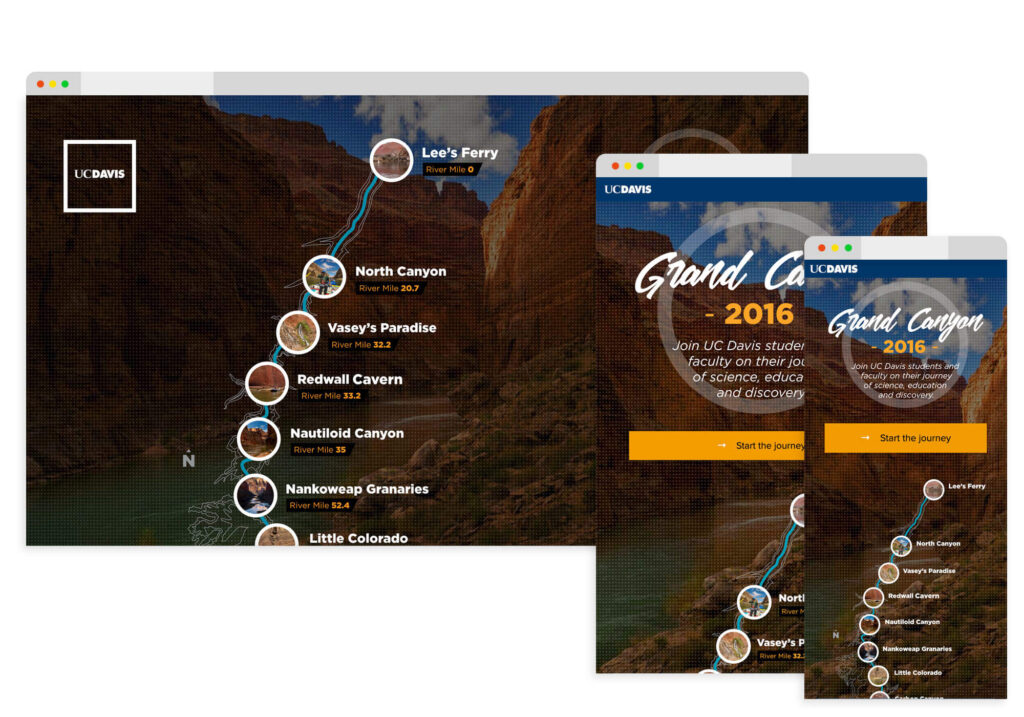
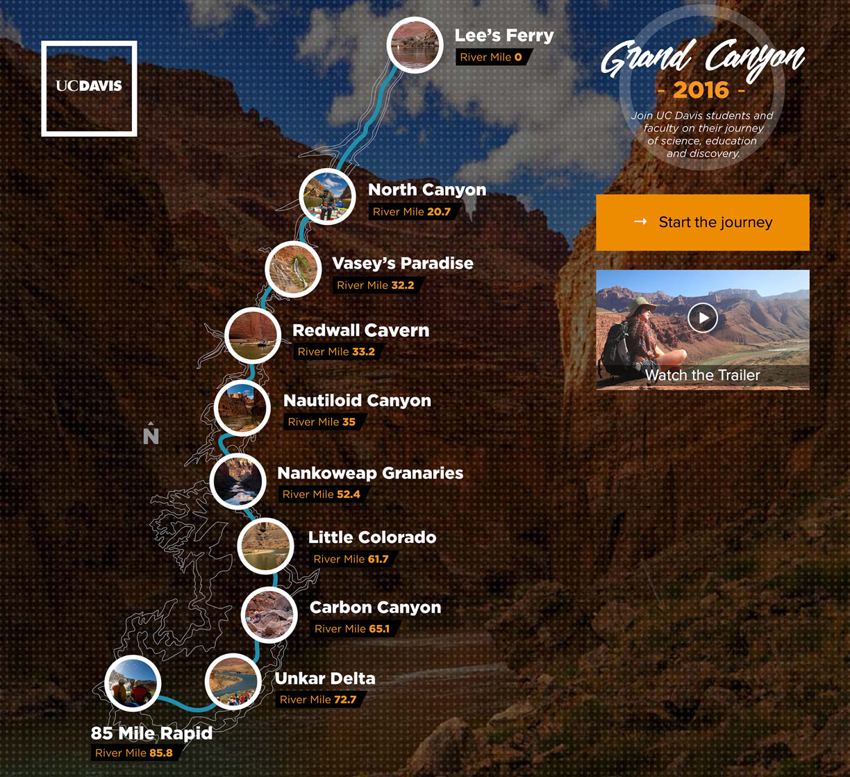
My early ideas were heavily focused on the geography of the trip. I wanted my UI to literally BE THE RIVER. In order to accomplish this, I knew I would need scalable graphics to maintain the fidelity of the design and allow for interactions. At the time interactive SVG’s were relatively new and I had to dig deep to discovers solutions that could give me what I wanted.
Adventure sites
Because this type of project was so rare in higher ed, I focused my competitive analysis on experiences presented on National Geographic, Outdoor Magazine and even outdoor retailers like Patagonia that created immersive retail campaigns. I gleaned a visual language from these sites the became the foundation of my style guide for this project.
User Flows
The initial user flows for the project were pretty obvious. There were 10 stops on the trip that we were taking the audience through so that was the beginning. From there I wanted to make sure the audience had every opportunity possible to make their way through that trip. I wanted them to be able to start in the middle, advance to the next stop, or just pick a stop that held more interest for them as a starting point.
Problem Statement
After completing the research I realized I would have to come up with ways to innovate within some existing and emerging technologies to achieve the look, feel and experience I’d conceived at the outset of the project. I needed a visual interface that kept the audience engaged, an experience that immersed them in the trip and a visual design that unified the interface with our extensive content.
My Solutions
Interactive SVG navigation
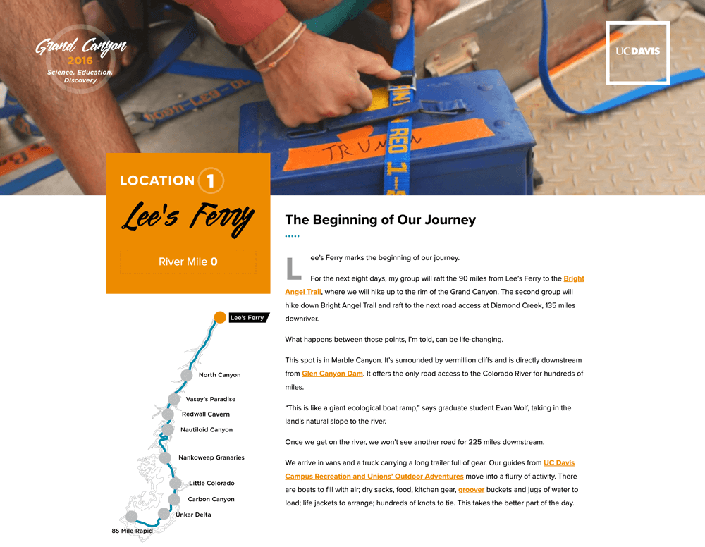
I created two graphical maps within Illustrator and modified the output code to keep SVG load times light and make the code accessible to javascript and CSS allowing for more advanced interactions. I placed the more complex version on the homepage as the primary navigation and the simpler version was placed on each trip stop page to keep the experience consistent. I also added advancer buttons to each page for folks that didn’t want to make the added navigational investment of a graphical interface.
Showcasing the canyon
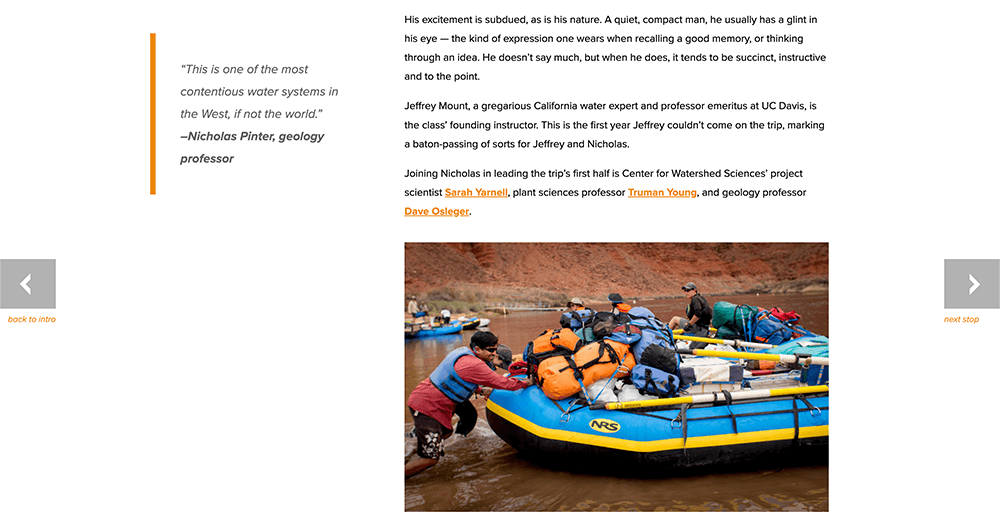
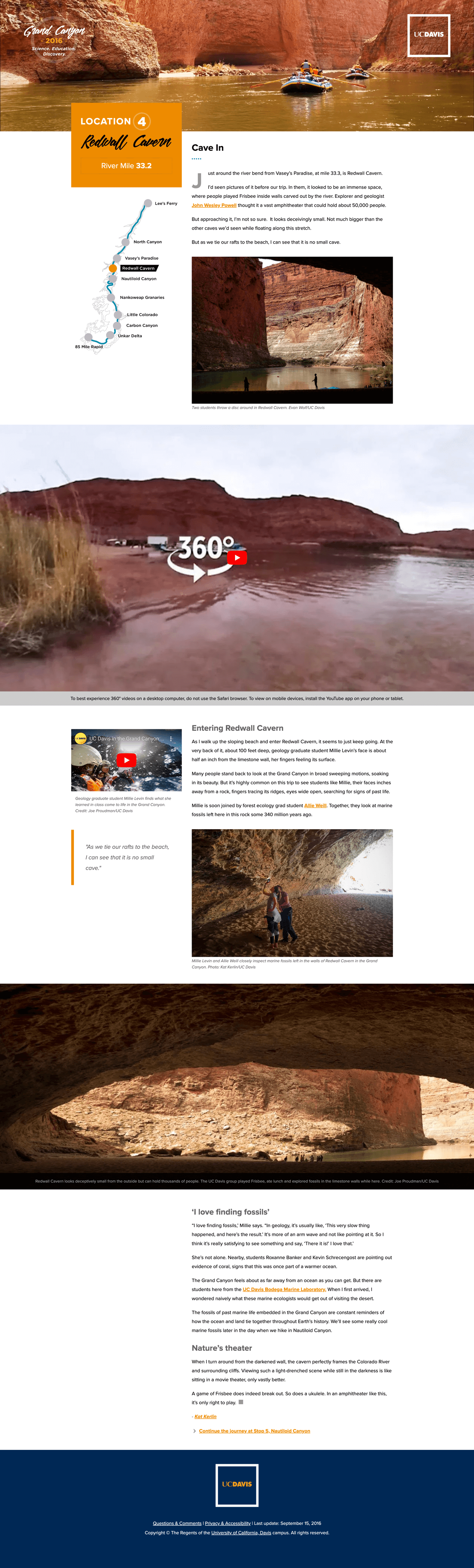
My colleague Joe Proudman was the lead videographer/photographer on the trip and he’d captured some amazing photography and video, including 360 degree video of many of the stops. To make the best use of this amazing content I used ambient videos as the lead in to many of the stop pages, added some animated gifs throughout the page content and created full width sections to feature the 360 videos. I placed large format imagery throughout the experience to keep the audience immersed and to break up the occasionally dense narrative content.
Bending the rules to go on an adventure
For the visual design of the project I wanted to step outside of our current brand. I felt we needed some new fonts and colors to give the project it’s own style and open up opportunities for similar designs down the road. I negotiated with our art director to add those new elements to the project and the result was a stand alone visual language that complimented our amazing content and visual assets while staying loyal to the UC Davis brand. The design was so successful that much of the visual language expressed in this project made it into our flagship website and news experience.

Final Product
Results
Regional Recognition
CASE District VII Grand Gold Award
This award was given by CASE District VII at their annual conference as a “Best Among Award Winners” title.
CASE District VII Gold Award in the Subsite Category
Issued by Council for Advancement and Support of Education (CASE)
National Recognition
From the Judges – “An in-house team leveraged various rich-media formats to create an immersive experience that instantly communicates the real-world excitement and hands-on educational experience a prospective student might expect from this institution. Interesting content in dynamic layouts is delivered via several navigation options, yet the viewer never feels lost. Storytelling is personal, exciting and infused with intellectual purpose. Statistics show high engagement with target audiences and social media, with unexpected spillover into wider media audiences. Project established new workflow and shared ownership for creative team.”
Political Capital
The success of this project gave our web division enough of a reputational boost to make broad changes across the university web ecosystem that had previously been politically impossible.
Let's work
Whether you need a complete rebrand, site audit, new content strategy or even want to commission a work of art, I would love to talk shop.
