The Know2Grow website is a b2b web portal design to market corporate training courses to established research and technology firms.
Exploring the problem
The founders of Know2Grow hoped to present themselves as a tech-friendly start up that was savvy enough to handle the cross-collaboration and leadership challenges so common in the research and tech industries. They already had a product line in place and wanted to become known as the go to corporate training resource for this sector.
My Role:
Art direction
Product design
UX/UI design & research
Information Architecture
Research
With a tight budget/timeline and limited access to any research populations or data, I focused on competitor research and the visual design strategies heavily employed to serve their target demo.
Inspo from the best I researched some of the most successful start up products websites of the last few years and found some common threads in the visual design and information architecture. Simplicity reigned supreme. Flat designs, illustrations and bold uses of color were common. Limited and efficient navigations led users directly to products and marketing was largely contextual.
Inspo from the worst The good news for Know2Grow was that their direct competitors hadn’t made significant investments in their customer facing digital products. Dated styles and confusing and inefficient navigations were common along with bad color palettes and basic user interactions.
Finding the audience After interviewing the founders of Know2Grow I was able to determine that the most likely target audience for this product were the founders of smaller firms or the HR directors of their larger clients. This allowed me to craft a targeted approach to my user flows and better refine my aesthetic.
Problem Statement
Keeping things simple was the biggest challenge with Know2Grow. Their products are comprehensive and they wanted to shout their virtues from the rooftops. That led to an overdose of marketing content. I was going to need to find ways not only to streamline the content delivery, but to match the spartan start up style the hoped to emulate. I also found some client anxieties when developing personas that made it necessary to be as transparent as possible about the services Know2Grow offered.
My Solutions
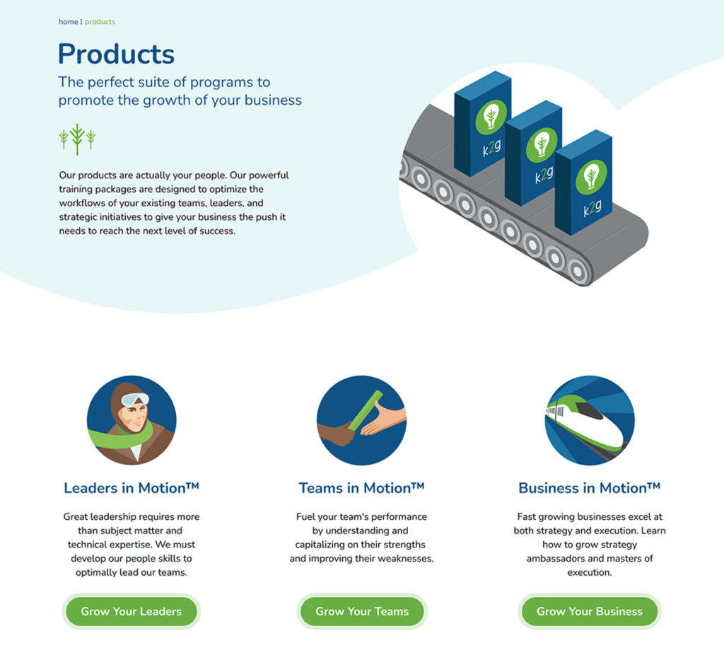
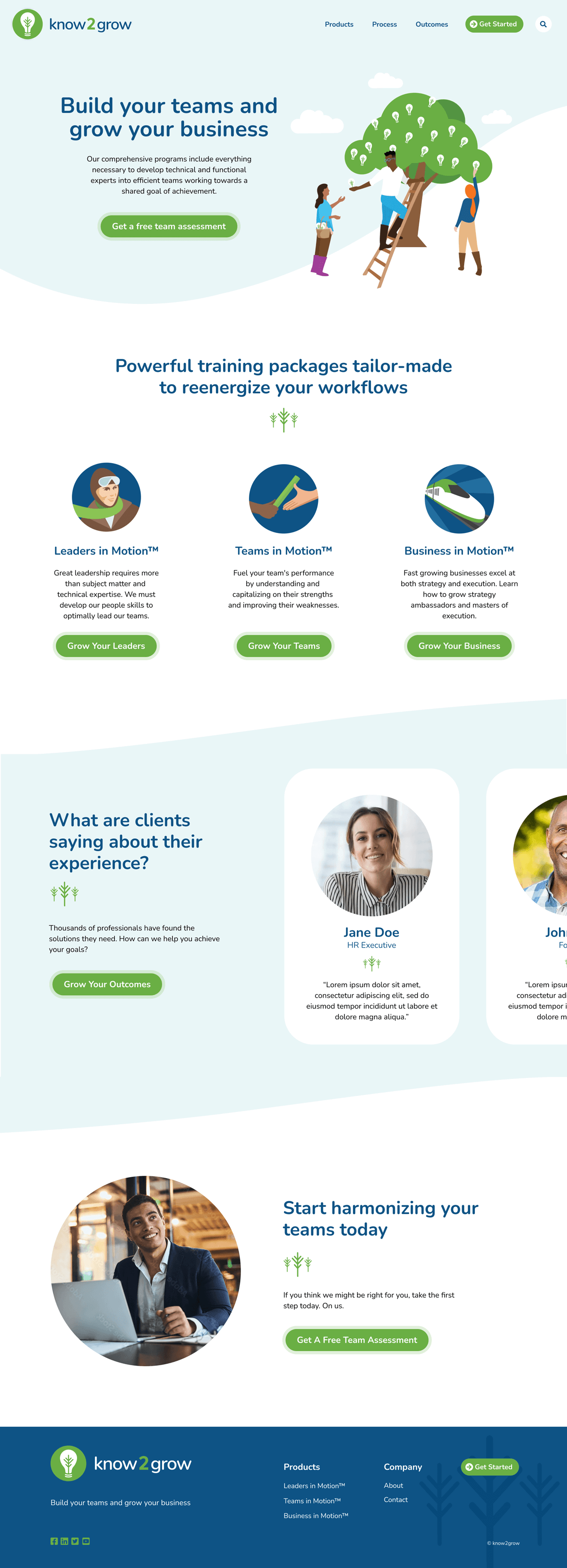
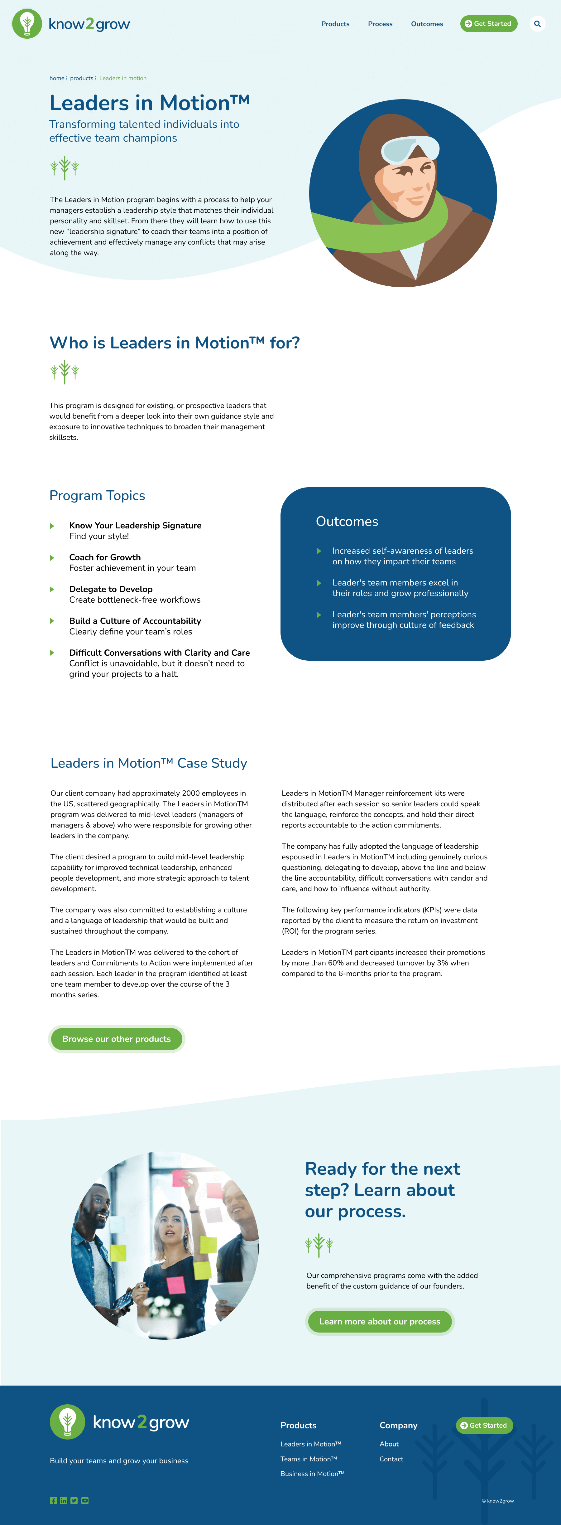
Illustrations and a light aesthetic To avoid the overuse of corporate stock photography so common on mid-level b2b sites I decided to create original illustrations to serve as imagery. This allowed me to extend their brand beyond their logo and create better imagery fits for the broader concepts. To create sub-brands for each of their products, I assigned each of them an illustration which helped to guide them through each product user flow. For my aesthetic I kept the pages open, airy and as simple as possible. I avoided the darker, denser pages I’d seen in my competitor analysis and moved my design closer to the inspiration I’d gleaned from my start up research.
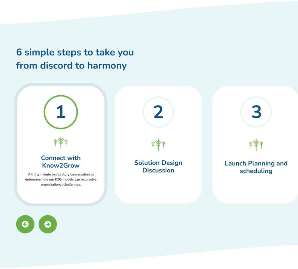
Simplifying the pitch At first thought, the idea of bringing in outside help to get your house in order can appear intimidating and even threatening. To ease some of the anxieties around Know2Grow’s training modules, I insisted on a descriptive “Process” page that using a simple content slider, walked users step-by-step through each phase of Know2Grow’s interactions with their clients.
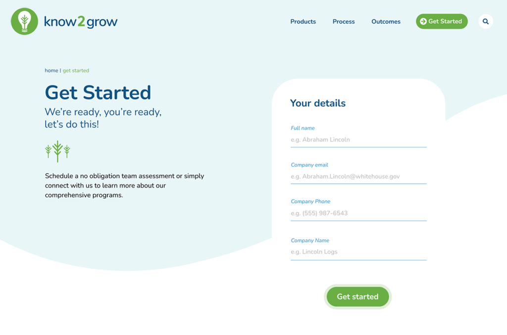
UX that maintained constant access to conversions Because the process was such an important part of the Know2Grow product, I made it the star of the show. Every product page pushes the user through the content and on to the next step, with all user flows culminating at the “get started” page containing the details on how to begin the consultation process. The content strategy was complimented by an easy universal navigation and bread crumbs to add another wayfinding option.